Consumers scan ingredient labels first and photos second. Colour drives appetite, but the line between a good shade and a good label is thin. If you are weighing a change from synthetic dyes to plant-based pigments, the goal isn’t only a nice hue. You need repeatable colour, a clean label, and a process your team can run without drama. This guide walks through what matters in the lab and on the line, so your next launch doesn’t stall at trial batch three.
What Are Natural and Synthetic Food Colors?
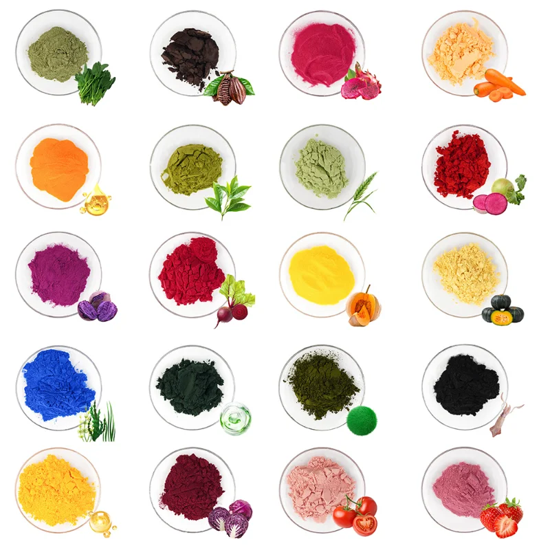
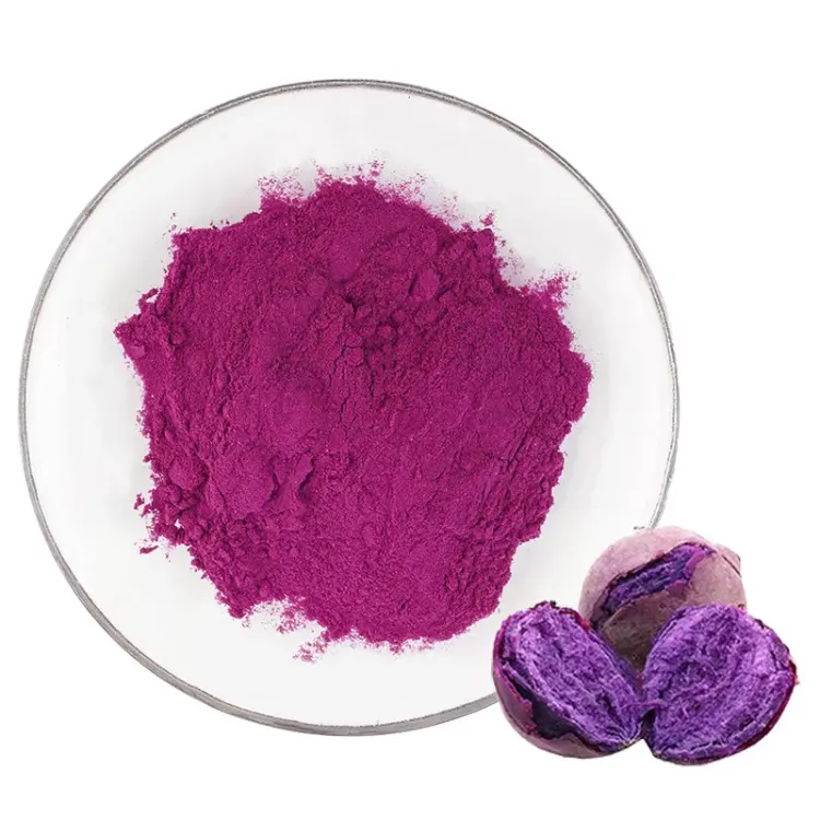
Before picking a replacement, it helps to map the two buckets clearly. Natural colours come from plants, algae, fruits, roots, and sometimes minerals. Typical examples include beetroot red for pinks, turmeric for sunny yellows, spirulina for blues, and purple sweet potato for lilac and plum tones. These arrive as liquids or powders, often standardised to a colour value, and they play nicely with clean-label statements.
Synthetic colours are made through chemical synthesis. They tend to be bright, highly uniform, and cheaper per unit of colour strength. They also offer broad stability across pH, light, and heat, which explains why legacy recipes still use them.
Natural Food Colors
Natural pigments work best when you match source to matrix. Beet powders lift colour in low-acid beverages and icing. Turmeric behaves well in bakery and snacks when heat exposure is moderate and light contact is limited. Spirulina gives a clear blue in neutral pH candies and frozen treats, while purple sweet potato handles a range of pH if you want berry notes without fruit cost. You get label appeal and familiar sourcing stories, provided the process is tuned.
Synthetic Food Colors
Synthetic dyes deliver intense, repeatable tones with less pigment. They tolerate bright lights in retail fridges and long bake cycles. The trade-off is consumer sentiment and, in some regions, tighter label warnings or restrictions. If your brand book leans clean and simple, you will likely phase them out over time.
Key Differences Between Natural and Synthetic Food Colors?
A colour choice is a bundle of trade-offs. Put them on one page and the path becomes clearer.
| Feature | Natural Colors | Synthetic Colors |
| Source | Plant or mineral derived | Chemically synthesised |
| Label Fit | Clean-label, plant-based | Often flagged by shoppers |
| Colour Tone | Softer, more “food-like” | Very bright and uniform |
| Heat/Light/pH | Sensitive, needs tuning | Broadly stable |
| Cost per Shade | Higher at equal intensity | Lower at equal intensity |
| Supply | Crop and season linked | Industrially consistent |
This is why many brands blend tactics. They pick natural for hero SKUs and keep synthetics for niche items with extreme process demands. Over time, process tweaks help natural options move into tougher applications.
Why Are More Manufacturers Switching?
Retail buyers ask for clean panels. Parents push for simple ingredients in kids’ foods. Export paperwork is easier when colour names read like pantry items. These signals add up.
From a product angle, you also get a look that fits modern photography. Natural reds and yellows sit closer to fruit and spice tones. Social posts look less “neon” and more edible. There is also the long game. Reformulating on your own clock beats reacting to sudden rule changes later.
Consumer-Driven Demand
You see it in survey after survey. Shoppers prefer plant-based colours and fewer additives, especially in confectionery, dairy drinks, and snacks for children. Packaging that says “no artificial colours” sits high on the shelf plan, even in value chains. If your category competes on trust, this is the lane to be in.
Regulatory Pressure
Some markets place warnings on certain synthetic dyes. Others review them more often. Moving to botanical sources reduces label friction and simplifies multi-country launches. It also helps when retailers update private-label specs with tighter lists.
Brand Image And Sustainability
Natural colours support stories about farms, crops, and simple processing. If you track ESG, plant sources and careful extraction methods are easier to explain than long chemical names. The story is not the product, of course, but it helps.
What Challenges Might You Face During The Switch?
Natural pigments can fade, shift, or separate when the base recipe fights them. That does not mean you need to accept washed-out shades. It means a little bench work upfront saves a lot of line time later.
Stability Issues
Heat, light, oxygen, and pH are the big four. Beet red will dull in strong acid or during long heat. Turmeric dislikes UV. Chlorophyll greens can brown if the matrix is too acidic. You can counter this with pH windows, encapsulation, antioxidants, or simple packaging moves like opaque sleeves for chilled drinks. If you need a practical primer, bookmark this guide to how to stabilize natural color and keep it near the mixer.
Cost And Supply
Crop-based inputs move with seasons. To avoid surprises, plan colour volumes early in the year and lock a spec instead of chasing open-ended shade goals. In return, you gain label strength that can lift price elasticities a little, especially in premium sets.
Colour Matching And Formulation
Don’t expect a 1:1 swap at the first trial. Natural tones have character. Dose curves are different. Start with small series: three dosages around your target, and two pH points if you have acid in play. Taste check as well. Most high-quality powders are neutral at working levels, but every base is different.
How Can You Switch Successfully?
A tidy process beats a big promise. Keep the workflow short and visible to both R&D and production teams.
Map Your Current Shades
List each synthetic dye by name, target Pantone or Lab*, and the matrix: beverage, icing, gummy, yoghurt, glaze. Flag where heat, light, or low pH apply. This table becomes your trial plan.
Pick Botanical Equivalents
For red, evaluate beet and anthocyanin sources. For yellow, trial turmeric or safflower. For blue, use spirulina. For greens, blend a stable yellow with a blue at your pH. If you need a ready-to-trial catalogue, review this natural food coloring powder library before ordering pilots.
Run Bench Trials In Tight Loops
Three dosages, two process tweaks, one packaging change if needed. Measure Lab* with a handheld colour reader after cooling and again after 24 hours. Log pH and temperature. Quick loops beat guesswork.
Lock Specs And Train The Line
Write a handling sheet: storage temp, light exposure, add-point, mix speed, hold time. Train one operator on each shift. Keep a golden sample card at the line for visual checks. Small things prevent large rejects.
Consider Private Label Or Co-Developed SKUs
If your team is thin, work with an OEM-ODM partner that can build a pilot, lock targets, and hand you a spec. You can read more about that model here: OEM-ODM. It speeds up development when the calendar is tight.
Case Examples In Beverages And Confectionery?
Real kitchens differ, but the patterns repeat. In carbonated soft drinks around neutral pH, spirulina blue performs well if you manage light with tinted bottles or sleeves. In still drinks with fruit acid, anthocyanin-rich sources give berry shades, though you may need to adjust pH a fraction for shelf life.
In gummies, a blend of turmeric yellow and a red anthocyanin produces warm orange without synthetic dyes. In white chocolate coatings, beet powder works for pink if you limit heat time and cool quickly. Bakeries often use turmeric for golden bakery glazes and cut open display time to keep tones bright under case lights. None of this is exotic. It is simple discipline and a checklist by the mixer.
Conclusion?
Natural colours deliver label strength and a look that fits modern food. Synthetic colours still win on raw stability and price per unit of shade. If your plan is to move, start with the items where natural pigments match the base easily. Keep the hard cases for phase two. The rest is clinic work: pH, dose, light, and heat. Cleaner labels follow from clean runs.
If you need a supplier profile you can share with procurement, YAYANG is a global manufacturer of plant-based colour powders and allied extracts. The company focuses on stable botanical pigments for drinks, bakery, confectionery, and dairy. Category teams often start with beet, turmeric, spirulina, and purple sweet potato, then extend into seasonal tones. The catalogue page lists specifications, application ranges, and typical pH and heat notes, so your formulators have data in hand. For custom projects, the service team supports trial blends and packaging tweaks, which is handy when retail buyers want a specific shade for a private-label brief.
FAQ
Q1: How do you pick the right natural colour for a low-pH drink?
A: Start with anthocyanin sources for reds and purples, then test at your actual pH, not only at 3.0 or 3.5. Log Lab* at day 0 and day 7, and check light exposure in the intended bottle. A small shift in acidity can make a big difference.
Q2: What storage rules help keep colour stable in powders and liquids?
A: Cool, dry, and dark. Seal bags after every use. Avoid long holds in warm syrup tanks. For line use, decant only what you need into opaque containers and return the rest to cold storage.
Q3: How do you keep turmeric from fading in bakery displays?
A: Limit direct light, reduce exposure time in warmers, and dose toward the upper end of your spec. A simple carton sleeve or tinted case glass can help in front-of-house.
Q4: Can botanical blues work in dairy?
A: Yes at neutral pH. Spirulina performs well in ice creams and yoghurt coatings. Add it late in the process after pasteurisation and keep the mix cold to protect tone.
Q5: Where can you review a full product list or start a custom brief?
A: Browse the products section for formats and specs at Products, then use the contact route on the site when you are ready to scope trials. For standard lines and quick pilots, details for natural food coloring powder are a good starting point.